![]()
3 May 2016
EFP upgrades its website with a modern look, easier navigation and greater functionality
Category:Communication

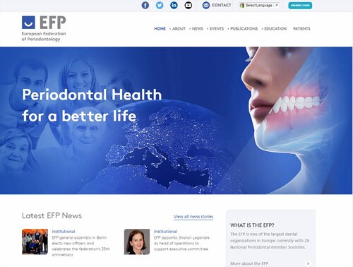
The EFP has launched an upgraded website with a more modern look that has been created to optimise viewing on mobile telephones and tablets.
With more than 300,000 different visitors to the website in 2015 – up from 167,000 in 2014 and 76,000 in 2013 – there was a clear need to upgrade the website to cope with this increased traffic.
The redesigned www.efp.org is easier to navigate and is more clearly separated into areas for professionals and patients. The home page provides a prominent link to the section dedicated to the needs of patients.
The latest news is now easier to read, with the four top stories appearing on the front page and with news arranged by categories such as science, events, education, and news from 29 EFP-affiliated national societies.
There is also a new section, Perio Insight, which offers in-depth analysis and opinion of key issues in periodontology and which will feature contributions from members of the EFP’s committees and from the national societies.
The website is “responsive”, meaning that pages are displayed in the optimal manner for whichever device is being used to view then. This means a much-improved experience for people who access efp.org on smartphones and tablets.
There is greater integration with social media, so that individual news stories can now be shared easily on Facebook, Twitter and LinkedIn. The news section also now includes a search facility.
The project was co-ordinated by Tiernan O’Brien, the new chairman of the External Affairs Committee (EAC) who was previously the EFP’s webmaster (a role that has now been assumed by Darko Bozic).
The Dublin-based web-design agency Web Together, briefed by the EAC, created the new design, which has been implemented by the EFP’s technical services partner Canterbury Web Services.
“The project initially involved a thorough analysis by the EFP and Web Together of the existing website and how different the use made of it by all the stakeholders,” explained Dr O’Brien. “From this, a mapping of the new design was possible, ensuring that all the relevant information and features were accessible in an intuitive way for the various users. This analysis was completed over a series of workshops and a lot of expert input from the design team at Web Together.”
He said that the most difficult part was not the choice of images and the overall appearance of the website but the designing of its architecture to ensure improved functionality.
“I would also not underestimate the huge amount of programming that was undertaken by Peter Collinson at Canterbury Web,” O’Brien added. “In all, over 250 pages had to be created and rendered functional resulting in a seamless switch from the old website to the new one.”
New features will be added to the website in the coming months, including a forum for clinical cases and a redesign of the sections for patients and the EFP’s postgraduate programme.
"I know that the new website is not perfect, and that it will need continuous improvement, but it does represent a huge improvement on the old design,” said O’Brien. “It is important to me that our website reflects the commitment of the EFP to periodontal health and well-being and our status as one of the global leaders in periodontology."
Darko Bozic added: “As the new EFP webmaster involved in the redesign of the website, I can only say that it was a joy to work on it. In a fast-changing world of easily accessible information, there was a need to change the old site. I hope that the new website will be judged as fresh, contemporary and appealing both to dentists and patients.
“I consider it as a living organ that will continuously evolve and change, bringing important scientific and clinical information to keep Europe as one of the forerunners in the field of periodontology.”


