![]()
15 June 2020
New-look EFP website is launched with enhanced section for patients and ‘brighter’ look
Categories:Communication, Institutional

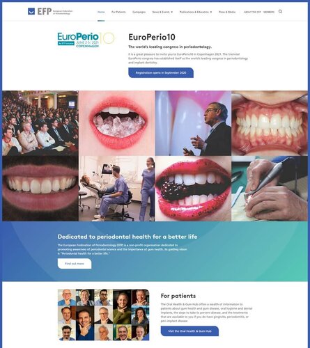
THE EFP website (www.efp.org) has been relaunched with a new look for new times and an enhanced section for patients.
The new website, which launched on June 15, represents a great step forward in terms of design, functionality, and offers a cleaner look and feel.
The main novelty is an updated and expanded section for patients. The new Oral Health & Gum Hub offers a wealth of information on gum disease, its prevention and treatment, and on dental implants and the prevention and treatment of peri-implant diseases.
This new section for patients includes a simple gum health self-assessment tool and useful videos that give instructions in oral hygiene and explain periodontal and peri-implant therapy.
The new website puts a greater focus on EFP campaigns: those that it has launched with its partners – such as Perio & Diabetes, Oral Health & Pregnancy, and Perio & Caries – as well as Gum Health Day and the toolkit for clinicians on the new classification of periodontal and peri-implant diseases and conditions.
There is a new section for press and media, providing press releases, background materials, and other resources for journalists.
“First of all, the new website has a fresher look and some new technical details that will give us more control over the content delivery and design of the pages,” said EFP webmaster Darko Božić. “It is now a more active page, that will hopefully engage the visitors with its video content, photos, and the information that the EFP delivers.”
‘A new look and a brighter feel’
The new website was created for the EFP by Liquid Light, a web-design company based in Brighton, UK, which will continue to work with the EFP’s communications team in maintaining and developing the site.
“Resourceful, navigable, and fresh” is the way that Tiernan O’Brien, chair of the EFP communications committee, summed up the new website. “We have a new look, a new navigation architecture, and a brighter feel to the website visitor’s experience.”
He explained that Liquid Light had been chosen, from a shortlist of 10 possible website developers, because “they were professional, had a lot of experience in dealing with international institutions, had great references, and were full of confidence that they understood our brief and could deliver it on time and on budget.”
He added that the most challenging part of creating the new website has been getting the balance right between the EFP as a global healthcare institution, an academic body, a resource for patients, a home for a federation of national societies, a news desk, and a working office space for the daily activities of the EFP.
“Individually each of these would have a different look and feel as a website,” he noted. “Our challenge was to create a blended website that would represent all of these aspects of the EFP.”


